

Why do some designs “pop” more than others?
Ever notice how on a webpage or poster, some things instantly grab your attention while others fade into the background? It’s not just magic – there's a fundamental design secret at play, and it's called contrast.
Think of contrast as the art of making some things in a design visually “louder” or more distinct than others. This simple difference is extremely powerful because it helps guide people's eyes, tells them what’s most important on the page, and makes everything clearer and more engaging to look at.
So, whether you're a business owner in Tokyo wondering how to make your services truly catch a customer's eye, or you're a student just starting to explore the exciting world of design and want to learn how to make your creations more effective, understanding contrast is a fantastic first step.
In this Contrast 101 guide, we're going to break down exactly what contrast is in simple terms, show you why it matters so much, and explore some easy ways you can start using it. Ready to learn how to make the important things shine? Let's dive in!
What does contrast look like in design?
So now that you know what contrast is, the next step is understanding what it means when we talk about contrast in design.
At its heart, contrast in a design context is simply about making different elements look noticeably different from each other. It’s about creating a clear distinction – a visual "pop" – between one thing and another on your page, screen, or poster.
Think of it like this: if everything in a design looked similar (similar size, similar color, similar shape), your eyes wouldn't know where to focus. It would look like a flat, uninteresting landscape. Contrast is the tool designers use to instead create something that’s dynamic and draws your eye to the crucial areas.
So, why is creating these differences such a big deal? Well, good contrast is like a secret weapon for your designs because it helps you to:
- Guide the Eye: It’s like a friendly pointer saying, "Hey, look here first! This bit is important!" It helps direct your audience's attention to where you want it to go.
- Boost Readability and Clarity: Imagine trying to read light yellow text on a white background. Proper contrast, especially between text and its background, makes things much easier to read and understand.
- Add Visual Interest: Designs without any contrast can look a bit dull and uninviting. Contrast adds some visual spice, making things more engaging and enjoyable to look at.
- Organize Information: It helps you show what’s most important, what’s secondary, and how different pieces of information relate to each other. This creates a clear structure and makes your message easier to follow.
Essentially, contrast helps you communicate more effectively by making sure the key parts of your design don't get lost in the crowd. It’s a fundamental building block for creating designs that work well and look great.
Easy Ways to Create Contrast (Your Toolkit):
So now we know why contrast is critical, but how does one actually go about creating it? Below are your first set of tools. There are more ways, but here are some of the easiest and most effective ones to get you started:
Color Contrast: Making Colors Pop

This is probably the one most people think of first, and the easiest to understand. Color contrast is all about using colors that stand out against each other.
- Using contrasting colors effectively: The most basic and often best way is to use light colors on a dark background, or dark colors on a light background. Think classic black text on a white page. You can also play with colors that are opposite each other on a color wheel (like blue and orange), or even just a bright color next to a more muted or neutral one. The key is that they look distinctly different.
- Tools for checking color contrast accessibility: This is an important step that many designers forget when they’re just starting out. In order to allow for your content to be seen and read by as many people as possible, including those with visual impairments, designing for accessibility is non-negotiable. There are free online color contrast checkers – a Google search will yield many. You can input your text and background colors, and they'll tell you if your contrast is strong enough (often based on standard accessibility guidelines like WCAG). Some design software and browser tools also have these checkers built in. It’s a quick check that makes a big difference.
- Examples of good and bad color contrast:
- 👍 Good: Dark grey or black text on a white or very light pastel background. A bright blue "Submit" button on a pale grey form.
- 👎 Bad: Dark blue text on a black background (hard to distinguish). Bright green text on a bright red background (can be jarring and hard to read for some). Yellow text on a white background (ow, my eyes!)
Size Contrast: Big & Bold, Small & Subtle

This one’s pretty straightforward – it’s about making some things bigger than others.
- Importance of varying sizes for elements: If everything is the same size, how would a reader know what to look at first? Varying sizes helps create a clear path for the eye.
- Creating emphasis through size difference: Generally, the bigger an element is, the more attention it will grab. This is why headlines are usually much larger than the regular body text. A big, bold image can also be a great focal point.
- Use cases for size contrast:
- Headlines vs. Paragraph text: Make your main titles big and your supporting text smaller.
- Important Buttons: Make a "Buy Now" or "Sign Up" button slightly larger or bolder than less critical buttons.
- Images/Icons: Place a large hero image at the top of a webpage, with smaller thumbnail images below.
Shape Contrast: Breaking the Mold

Using different shapes can really make an element stand out and add some personality.
- Utilizing different shapes to create visual interest: Most web content is contained in rectangular boxes. That means that introducing a circle, an organic (curvy) shape, or even just a rectangle with uniquely rounded corners, it can instantly draw the eye because it’s noticeably different from its surrounding elements.
- Examples of shape contrast in design:
- A round profile picture icon next to square or rectangular text boxes.
- A starburst shape for a sale announcement.
- Using an arrow for a button that directs action.
- Combining shape contrast with other types: Shape contrast works brilliantly with other types. Imagine a large, brightly colored circular button – that’s using size, color, and shape contrast to really make an impact.
Texture Contrast: Adding a Tactile Feel (Even Digitally)

Texture in design refers to how an element looks like it would feel, if you were to touch it.
- Adding depth and realism with texture: Even on a flat screen, textures can make things look more three-dimensional and real. Think of a design that uses a subtle paper texture for the background, or a button that looks slightly glossy or metallic.
- Balancing smooth and rough textures: You can create contrast by placing a "rough" textured element (like a gritty photo background) next to a "smooth" element (like clean, flat-colored text boxes).
- Texture in digital design: This can be subtle – a background image with a slight fabric feel, a pattern used in a section, or even implied textures like making a button look a bit like brushed metal. It doesn't need to be overly obvious to add a touch of contrast and depth.
Value Contrast: The Power of Light & Dark
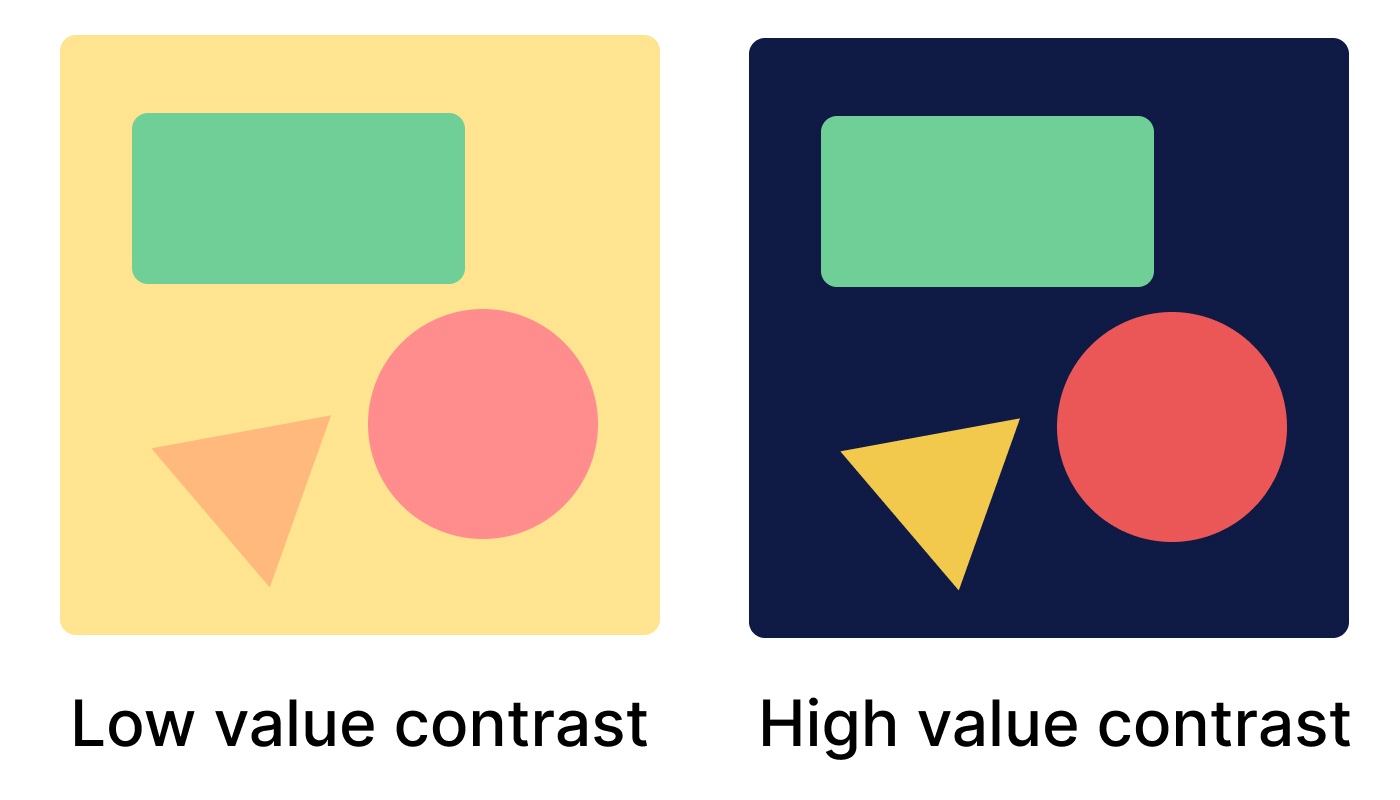
Value simply refers to how light or dark a color is, regardless of what the actual color (hue) is.
- Difference between light and dark: Think about a black and white photo – it only uses values (shades of grey from pure white to pure black). Any color has a value too – there’s light blue and dark blue, light green and dark green.
- Using value to guide the eye: Strong differences in value are really good at catching attention. A very light element on a very dark background (or vice-versa) will stand out more than two elements with similar lightness or darkness.
- Creating mood with value contrast:
- High value contrast (big differences between light and dark) can create a dramatic, energetic, or very clear feeling.
- Low value contrast (elements are closer in lightness/darkness) can create a softer, calmer, or more subtle mood.
The above tools can provide you with a start on how to play with contrast. It’s not necessary to use all of them at once, but knowing they exist gives you a lot of options for making your designs clear and attention-grabbing.
Quick Tips for Using Contrast Wisely
So now you've got your toolkit packed with different ways to create contrast. But like any powerful tool, it’s important to use it wisely. Here are a few quick tips to help you use contrast effectively, without going overboard:
- Don't Go Wild – Subtlety is Often Your Friend It can be tempting to try and make everything stand out, but if everything is shouting, then nothing really gets heard. Too much contrast everywhere can make a design feel chaotic, busy, or even stressful to look at. Sometimes, a little bit of contrast goes a long way. Aim for clear distinctions, not just loud noise.
- Use Contrast with a Purpose (Think Hierarchy) Ask yourself: "What's the most important thing I want someone to see or do on this page/screen?" Use your strongest contrast to highlight that primary element (like a main headline, a key benefit, or a call-to-action button). Then use less strong contrast for secondary information, and even less for tertiary details. This creates a clear visual hierarchy, guiding your audience smoothly through your content.
- Always Check for Accessibility (Especially with Colors & Text) This is a big one! While making things visually different is good, you need to ensure your choices are readable and usable for everyone, including people with visual impairments like color blindness. We touched on color contrast checkers earlier – use them and use them often. Make sure your text has enough contrast against its background. Also, consider if your font sizes and weights provide enough contrast for easy reading.
- Think About the Mood and Your Brand The amount and type of contrast you use can really affect the overall feeling or mood of your design.
- High contrast (big differences in light/dark, bold colors) can feel energetic, modern, and direct.
- Lower contrast (more subtle differences, softer colors) can feel calmer, more sophisticated, or even gentle. Make sure your contrast choices align with the personality of your brand and the message you want to send.
- Step Back and Get Fresh Eyes Sometimes, when you've been staring at a design for a while, it's hard to see it objectively. Once you think you've applied contrast well, step away for a bit. Then come back and look at it with fresh eyes. What’s the very first thing you notice? Is it what you intended to be most prominent? Even better, ask someone else (especially someone who hasn't seen it before) what stands out to them. Their feedback can be incredibly helpful!
Using contrast wisely is all about making thoughtful choices to help people understand and engage with your design more easily. Keep these tips in mind, and you'll be well on your way.
Start Making Things Pop
So, that's the magic of contrast in a nutshell. It's all about making key parts of your design clearly different to guide the eye, boost clarity, and make everything far more engaging.
We've seen how simple changes in color, size, shape, and more can make the important stuff truly stand out. Now that you know these basics, you’ll start spotting contrast (or where it’s needed!) all around you.
Don't hesitate to try these ideas out in your own work. Even small, thoughtful uses of contrast can make a huge impact. It’s a simple yet powerful step towards creating more effective and user-friendly designs that really connect.
If you're looking beyond the basics and thinking about how to create a really effective and professional design for your website, app, or any digital project – ensuring everything important truly stands out and works together beautifully – the team at Tokyo Techies can help. Based right here in Tokyo, we offer expert design and development services to bring your vision to life and make your online presence shine. Feel free to get in touch with us for a chat about your project!
.png)